The rebrand follows an internal review of the company’s positioning, with
Bókun stating that its previous visual identity no longer reflected the
platform’s scale, ambition, or market role, despite its position as a
connectivity partner across major online travel agencies.
The updated brand introduces a new logo, an expanded colour palette, and a revised brand mission under the tagline “The How To Your Wow.” According to the company, the refreshed identity is intended to reinforce its focus on supporting experience providers with operational and booking technology.
As part of the rebrand, Bókun has outlined a renewed promise to tour
operators and experience providers, positioning the platform as the operational
backbone behind activities, attractions, tours, transportation, and events,
while enabling operators to focus on delivery and guest experience.
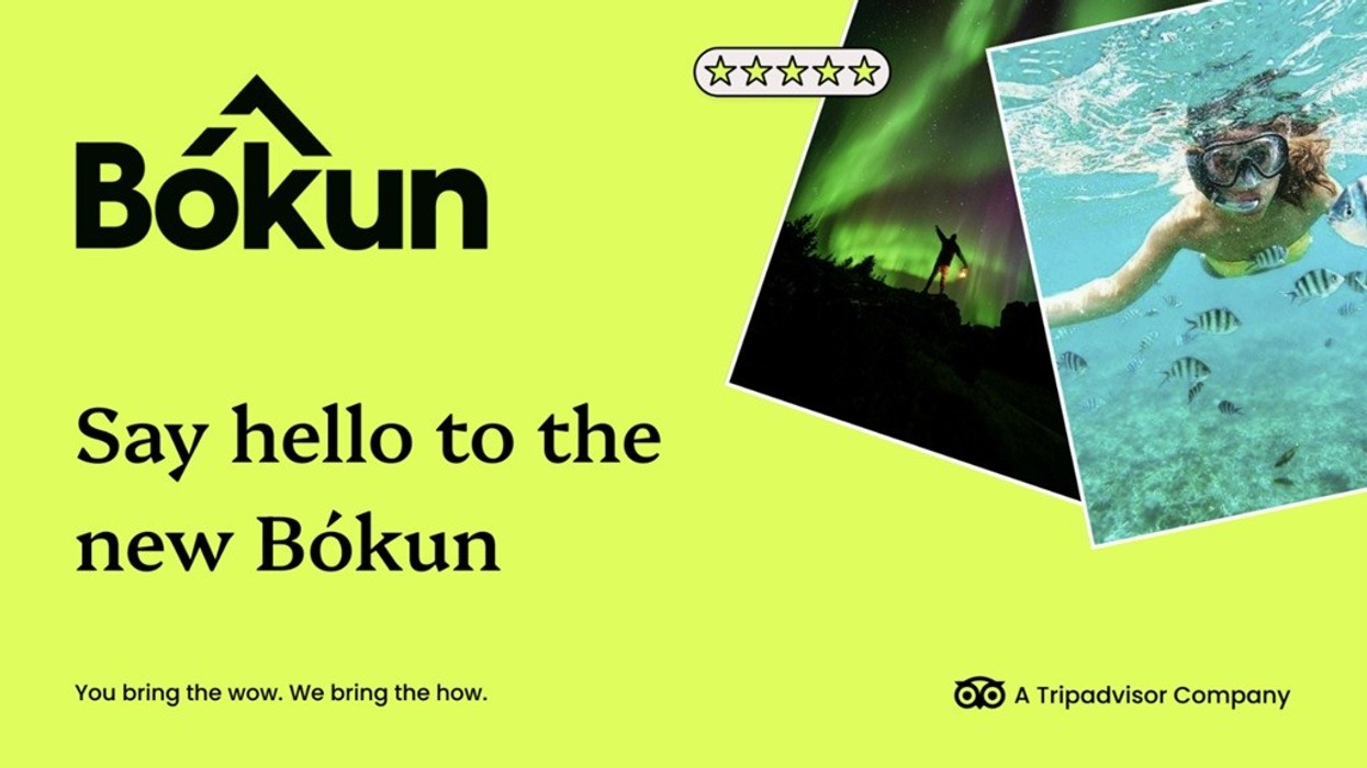
The new visual identity replaces the company’s former blue colour scheme
with a neon green palette. The update aligns the brand more closely with the
wider Tripadvisor visual family, while aiming to establish a more distinctive
and confident presence within the travel technology sector.
The redesigned logo references the company’s Icelandic origins, replacing the previous mountain motif with an abstract peak. The design is intended to symbolise a balance between technical precision and human connection.
“In the past, our brand didn’t fully reflect what we do,” said Ian Macleod, Director of Marketing
at Bókun. “This isn’t just a new look – it’s a new way
of showing the world who we are. Bold, confident, and purpose-driven, our brand
now matches the ambition and energy of everything Bókun delivers.”
Jennie Peacock-Putt, General
Manager at Bókun, added: “We’re proud of what we’ve
built, and this new brand represents the next phase of our journey. We’ve
always powered incredible travel experiences – now our brand finally reflects
that.”
Tags: Ian Macleod, Jennie Peacock-Putt, Bókun, Tripadvisor